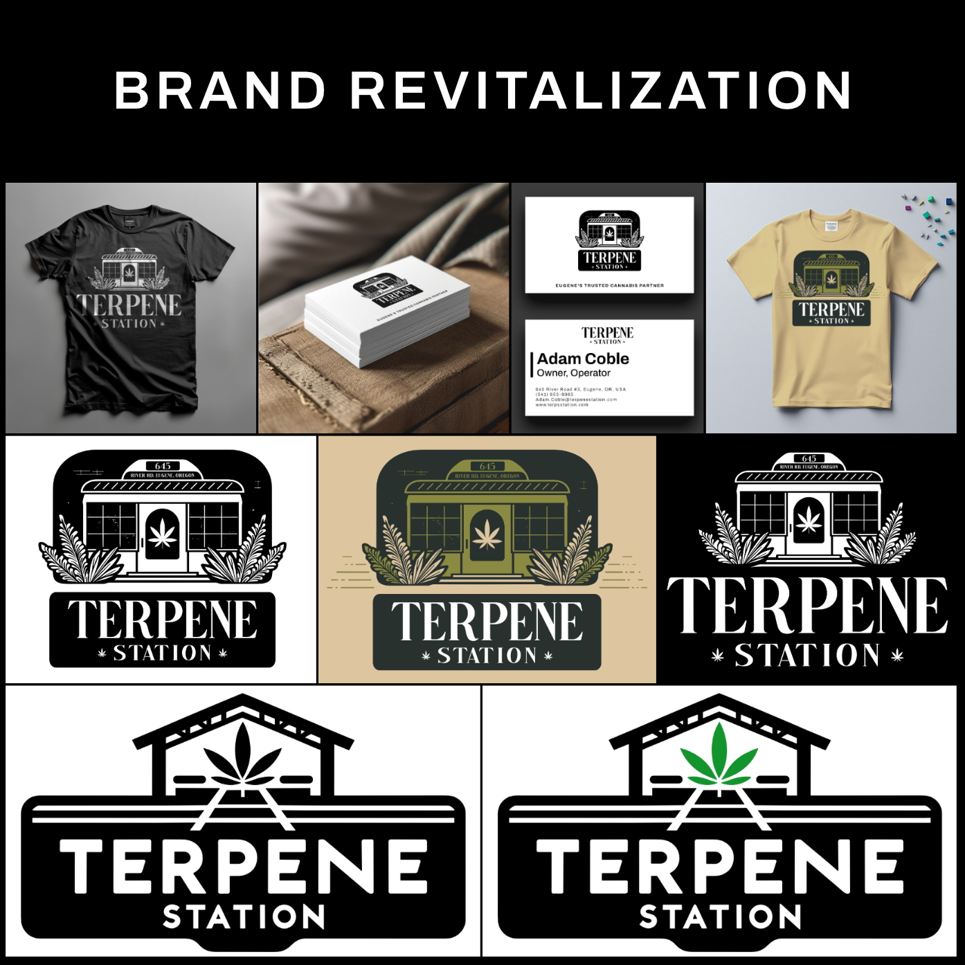

Here is a recent project where I redesigned the brand and logo for a cannabis dispensary called Terpene Station. Previously their logo was of a train, that didn't connect to the concept at all. The concept for the store is
* A warm, friendly local supplier of cannabis products
* inviting imagery
* Leaning more on the "station" aspect