
Créés sur 99designs par Vista
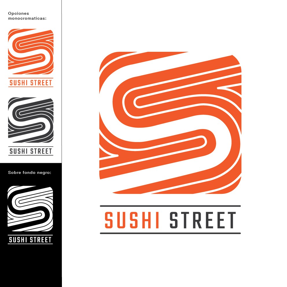
I tried to keep things simple by limiting the use of colors in order to make the design easily adjustable on different materials/backgrounds. Playing with the fat line of the salmon, I was able to create the "S" shape to symbolize Sushi Street. The goal is for the icon & text to be usable separately, but it works also when put together.