Hand Lettering Logo for Coffee Company

39
Créés sur 99designs par Vista
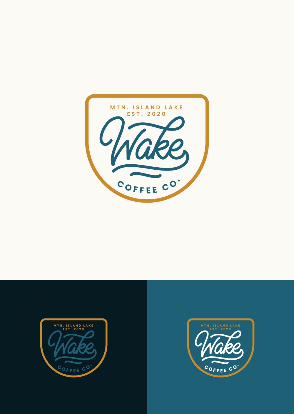
The goal is to highlight lake life in their area with high-end vibes. The emblem of the logo is not just a cup of coffee shape but also represents a space that gathers a value that your brand has, with a golden color that symbolizes abundance and prosperity, luxury, and quality also like a sun color that brightens your day. Hand-written script typography as the main logo has a psychological meaning for earning all-important customer affinity. Also, a wave/water modification on the logo emphasizes the lake as the location of your business also the calmness and comfort that the brand will guarantee the customer.