Brochure: WESTON Psychiatric

14
Créés sur 99designs par Vista
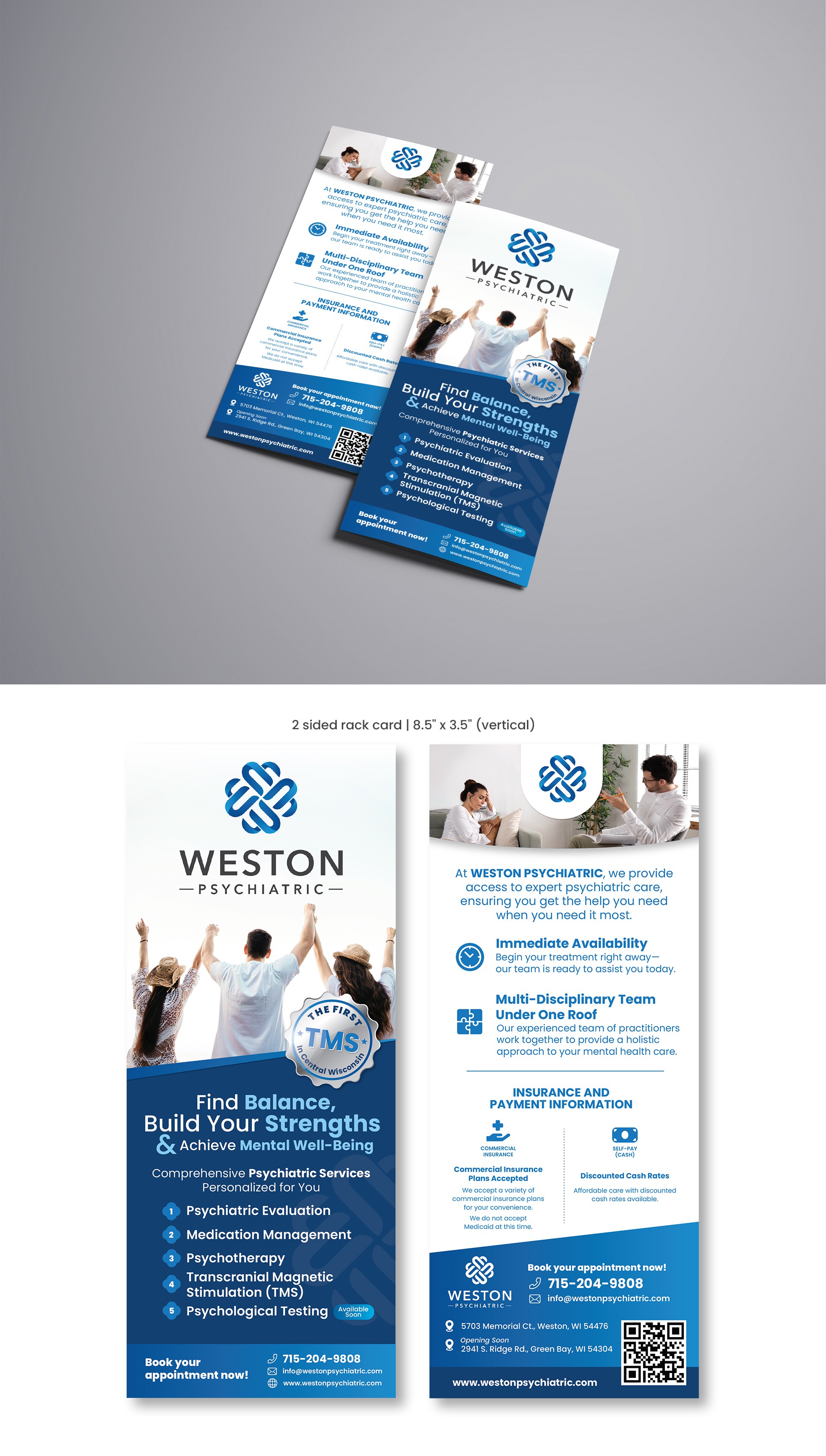
I made the logo and image bigger to be more prominent and stand out. To make the overall design more striking, I added a graphic element in the form of a badge that communicates the product's USP, which is 'the first TMS in Central Wisconsin,' as I believe this service needs to be highlighted. I uses a blue background on the first page, making the overall visual much more striking and significantly improving readability.