Logo for baby products

0
Créés sur 99designs par Vista
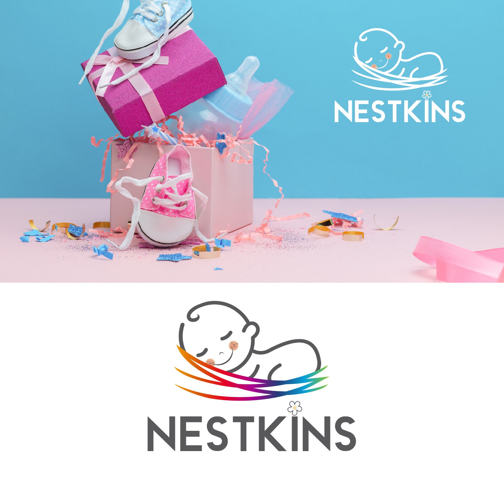
I've include a nest, because it's a visual according to the business name. I've used rainbow colors for it to highlight the idea that Nestkins provides anything that a baby needs, this is why the baby is so calm and peaceful.
The flower above letter "i" has the role to make the font not so rigid. I believe the font is perfect for the brand, strong, bold, but in a professional way. The added flower gives a more playful look.